Understanding color’s biological reactions, subliminal meanings, and cultural influences is a tool for designers to establish the mood, purpose, and hierarchy of space.
The Institute for Color Research says that individuals subconsciously judge people, environments, and products within ninety seconds—and 62-90% of that assessment is based solely on color.
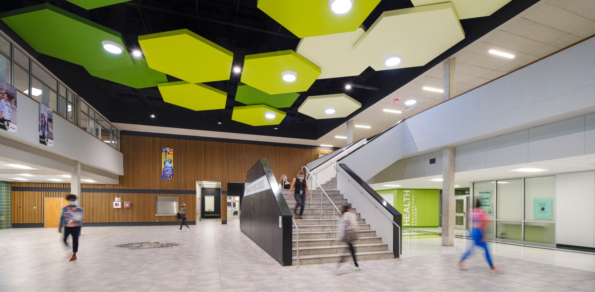
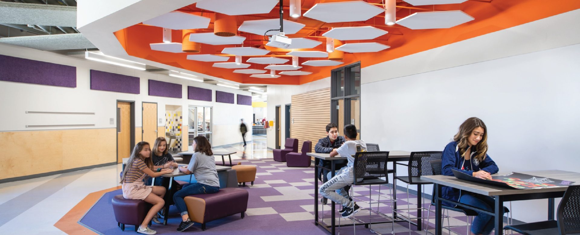
The lobby of Southwest HS was transformed with color. Visual mass, vertical interest, and rhythm were added by strong color choices and bright geometric clouds. The light floor balances the dark exposed structure and st
WHY?
It starts with our prehistoric ancestors. They needed to distinguish shape and color for survival and navigation. The need for visual cues became inherent in our genetic code so much so that our nervous system now requires environmental stimulation. Think of the difference in your mood on a sunny day versus how you feel on an overcast day.
In addition to the physiological effects of color, it can also affect the subconscious as a result of individual personal experiences. Color can also include cultural color associations like red meaning stop or warning. Because it’s impossible to anticipate all psychological reactions to color, it’s important to design to universal norms.
These norms include the fact that most young people prefer saturated colors, while older individuals prefer muted. Scientifically, this is caused by a decrease in pupil size as we age, which makes us less responsive to light variations.
HOW DOES THIS RELATE TO EDUCATIONAL ARCHITECTURE?
If young people prefer saturated colors, make our schools colorful! That’s only half of the equation. Studies also show overstimulation can result in muscle tension, rapid breathing, and increased blood pressure—stress.
This is evident in color research where a subject’s pulse increases when exposed to red wavelengths and decreases when exposed to blue wavelengths— whether the subject is blindfolded or not!

THEN PAINT THEM WHITE OR GRAY!
Going to a colorless or monochromatic scheme is not the solution either. Studies also show understimulation can cause restlessness, lack of concentration, and irritability— traits not conducive to promoting active and engaged learning.
The challenge is introducing color and walking the line between over and under- stimulation.
Research since the 1950s has shown that the simple addition of color to elementary school walls can have a positive effect on academic achievement.
In her article for American School & University Magazine, Kathryn Grube, Assistant Professor of Interior Design at Johnson County Community College notes that color can create an environment of creativity and positive emotions that can improve long-term memory. She also sites that color can connect the right and left hemispheres of the brain. Which, as she points out, is particularly helpful technology increasingly infringes on the use of books which are processed through the left brain by converting text into images.
An interesting study done by Fazila Duyan, Ph.D. and Rengin Ünver with the Department of Architecture, Yildiz Technical University in Istanbul, Turkey found that student attention can be directly impacted by the use of color in the classroom.
In their 2016 paper “A research on the effect of classroom wall colours on student’s attention,” the researchers worked with third graders, 18 girls and 26 boys from an Istanbul private school and 21 girls and 13 boys from a neighboring state school. The private school students were middle-upper class socio-culturally while the state school students were middle-lower class.
Using the Munsell Colour System to standardize the colors, the researchers had the experimental group and 74 additional students tested for color vision deficiencies. The students passed and were then given 15-20 minutes to complete a wall color preference survey to determine the finalists for the experiment. The five chosen colors for the experimental classrooms were purple, blue, green, yellow, and red.
The students attended class in a colored room for a week. On Friday they took the Bourdon Attention Test which is 20 lines of letters with 22 letters per line. The students are given two minutes to find four letters. The sequence of the letters changed weekly to avoid rote responses, and then the classrooms were repainted over the weekend to the next color.
At the end of the test, the results were interesting. Regardless of socio-cultural conditions, attention scores in the purple room were highest followed by blue, green, and yellow. Red scored the lowest overall.

TAKEAWAY
The strategic use of color can serve many functions. Color can establish hierarchy, provide visual weight and balance, create a visual rhythm that is calming and orderly, and it makes an effective wayfinding tool.
When designing your facility, think about how color can create a unique environment and identity. Color in architecture is more than decorative preference; it is an integral tool in establishing design intent. Color provides the subconscious cue of how we feel and behave in different spaces, and it irrefutably impacts how users learn, study, work, and play.