Pfluger Dallas Office

Dallas, TX

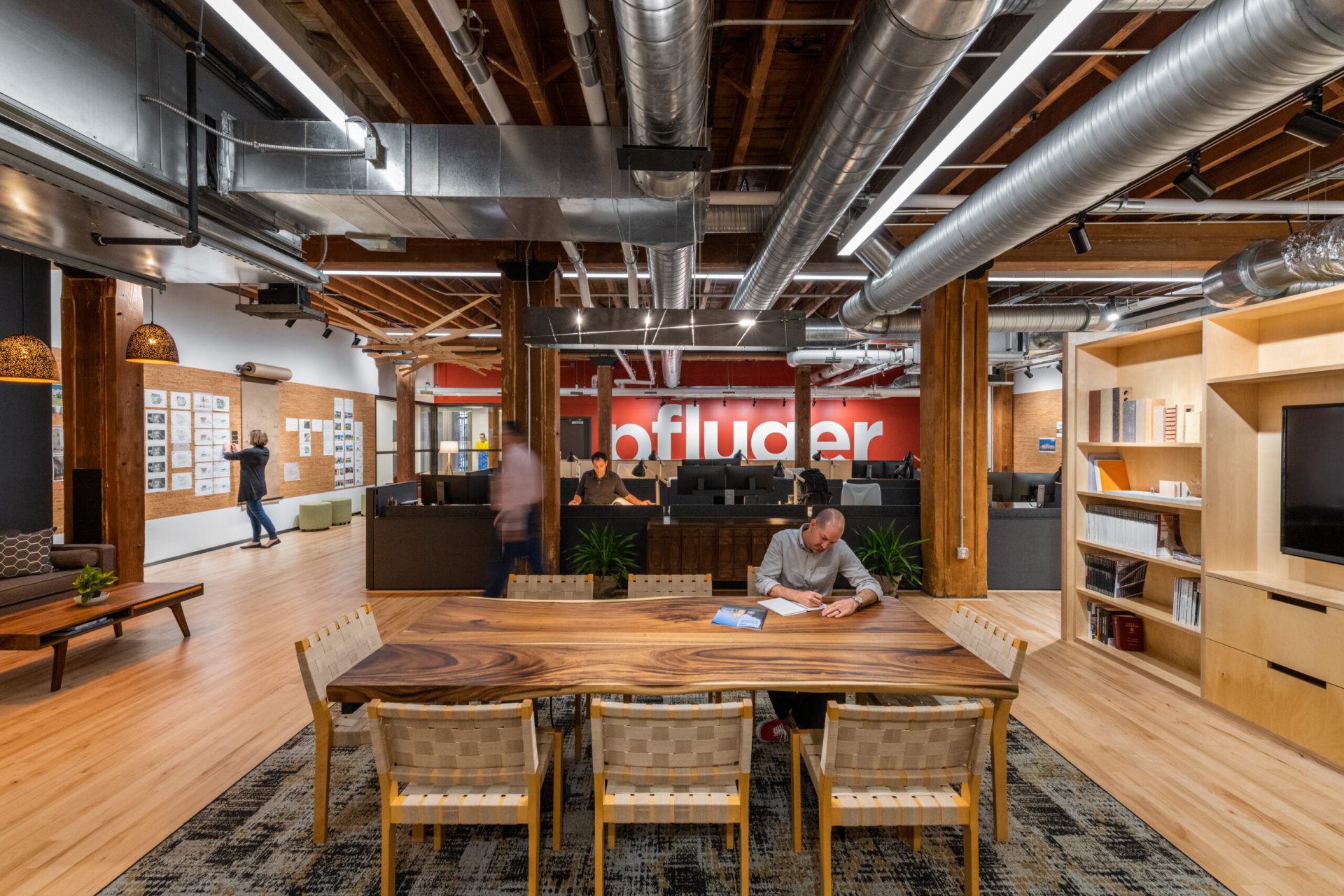
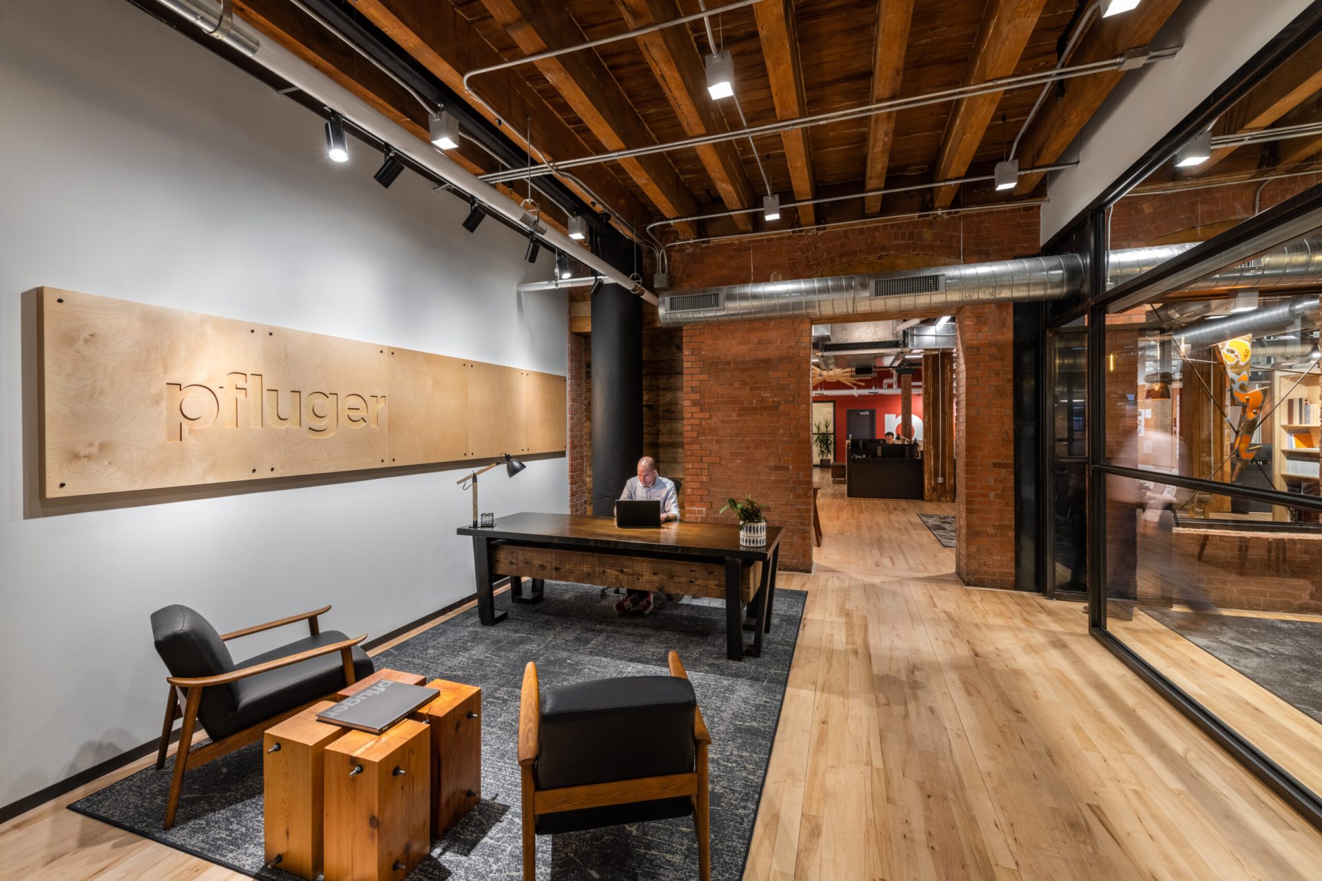
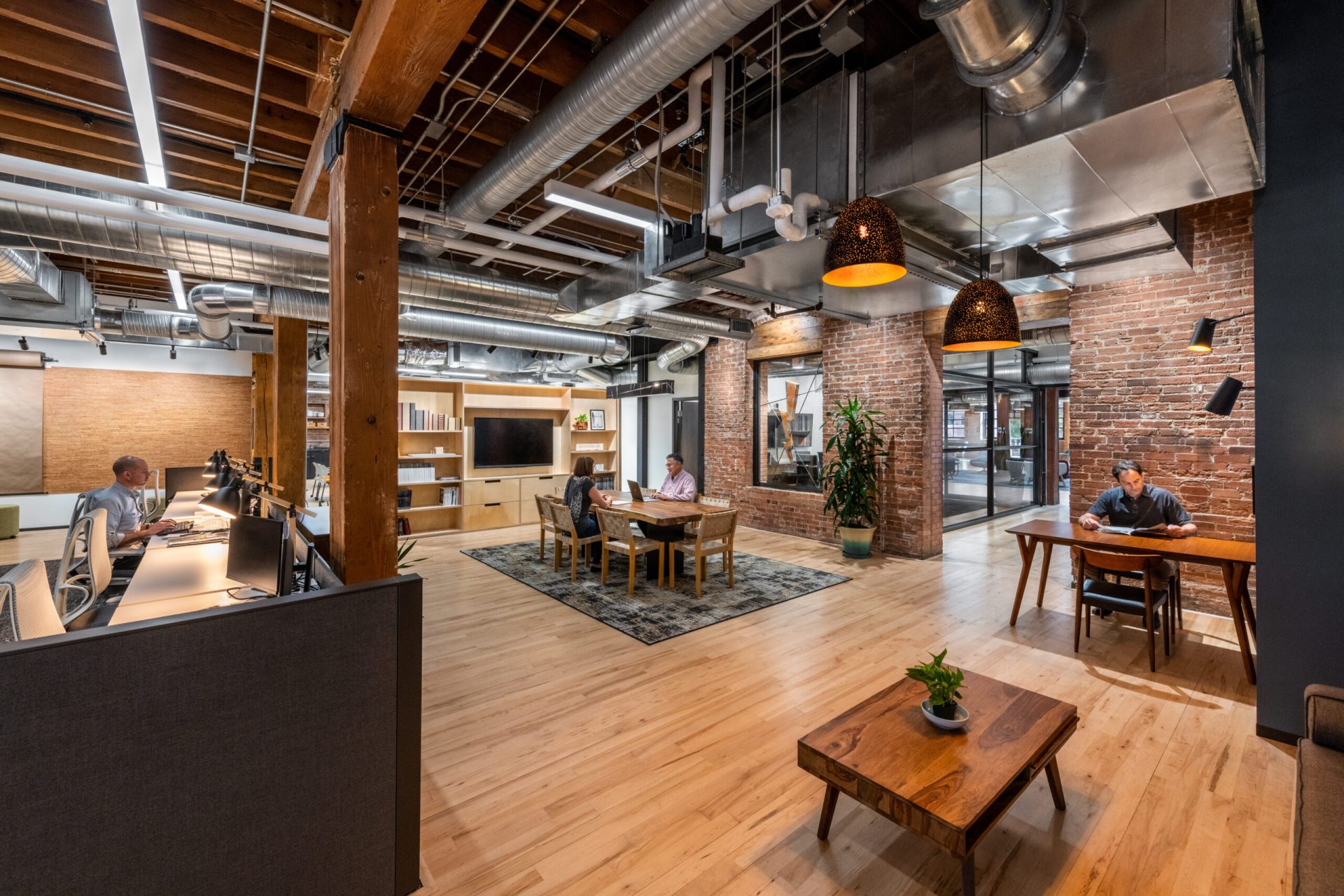
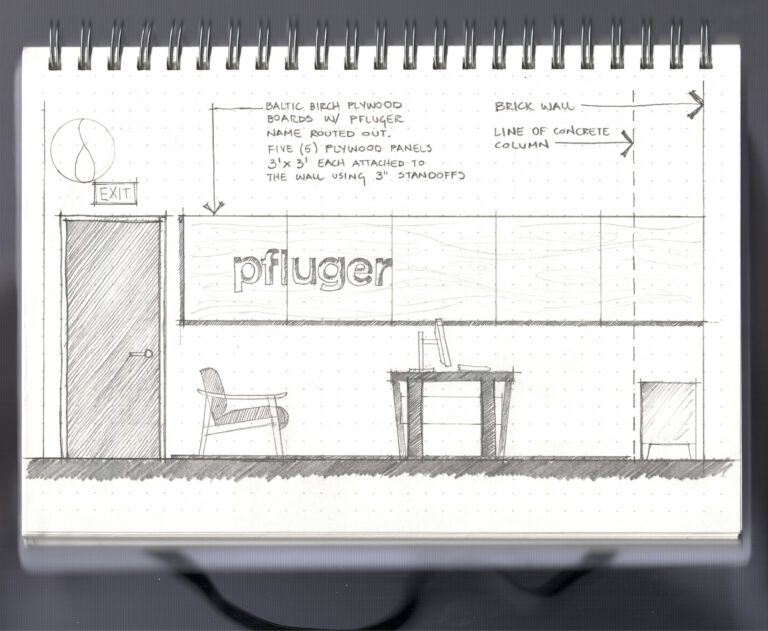
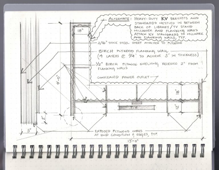
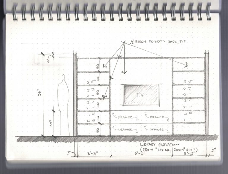
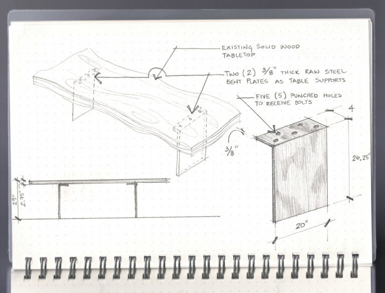
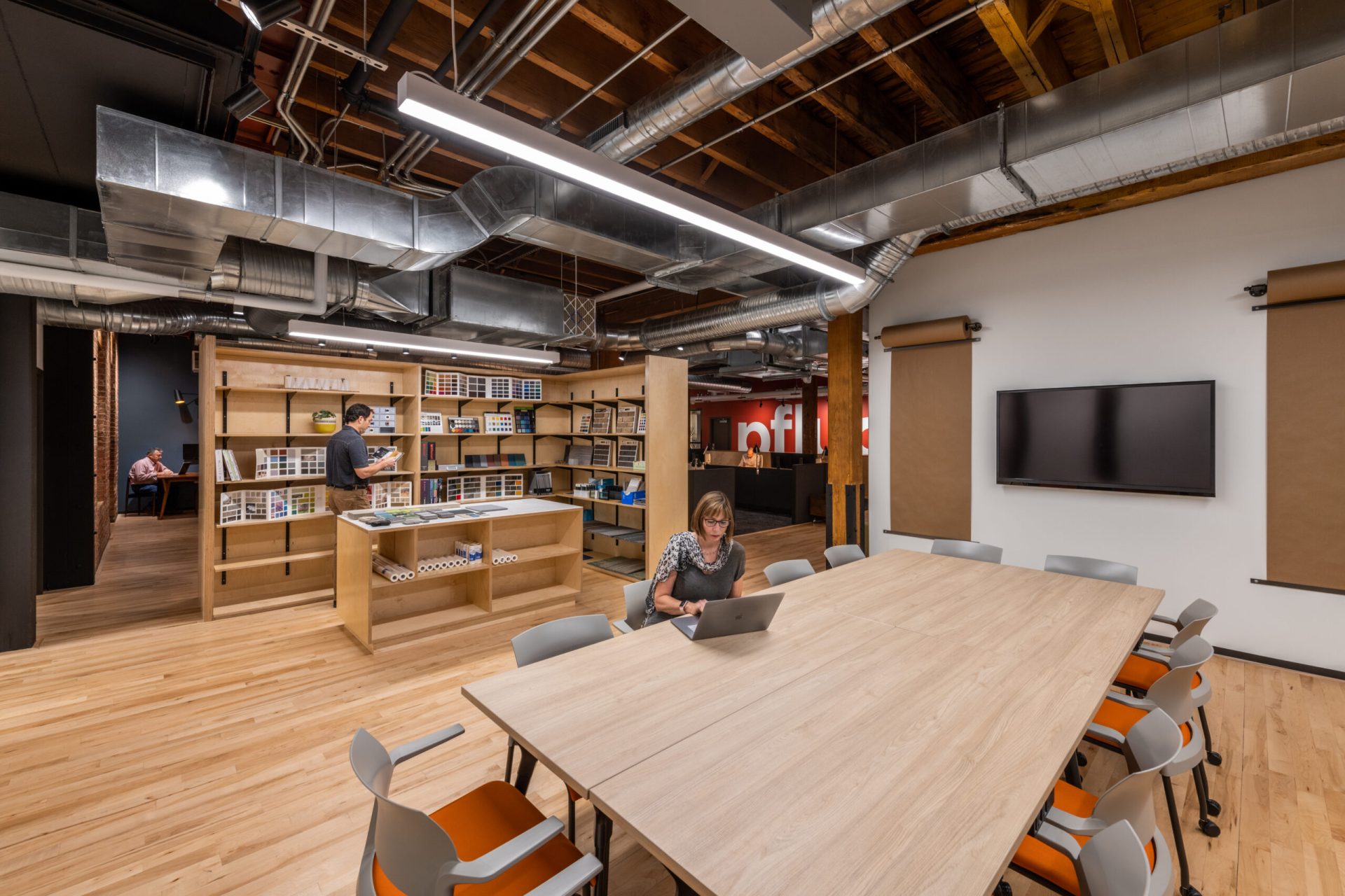
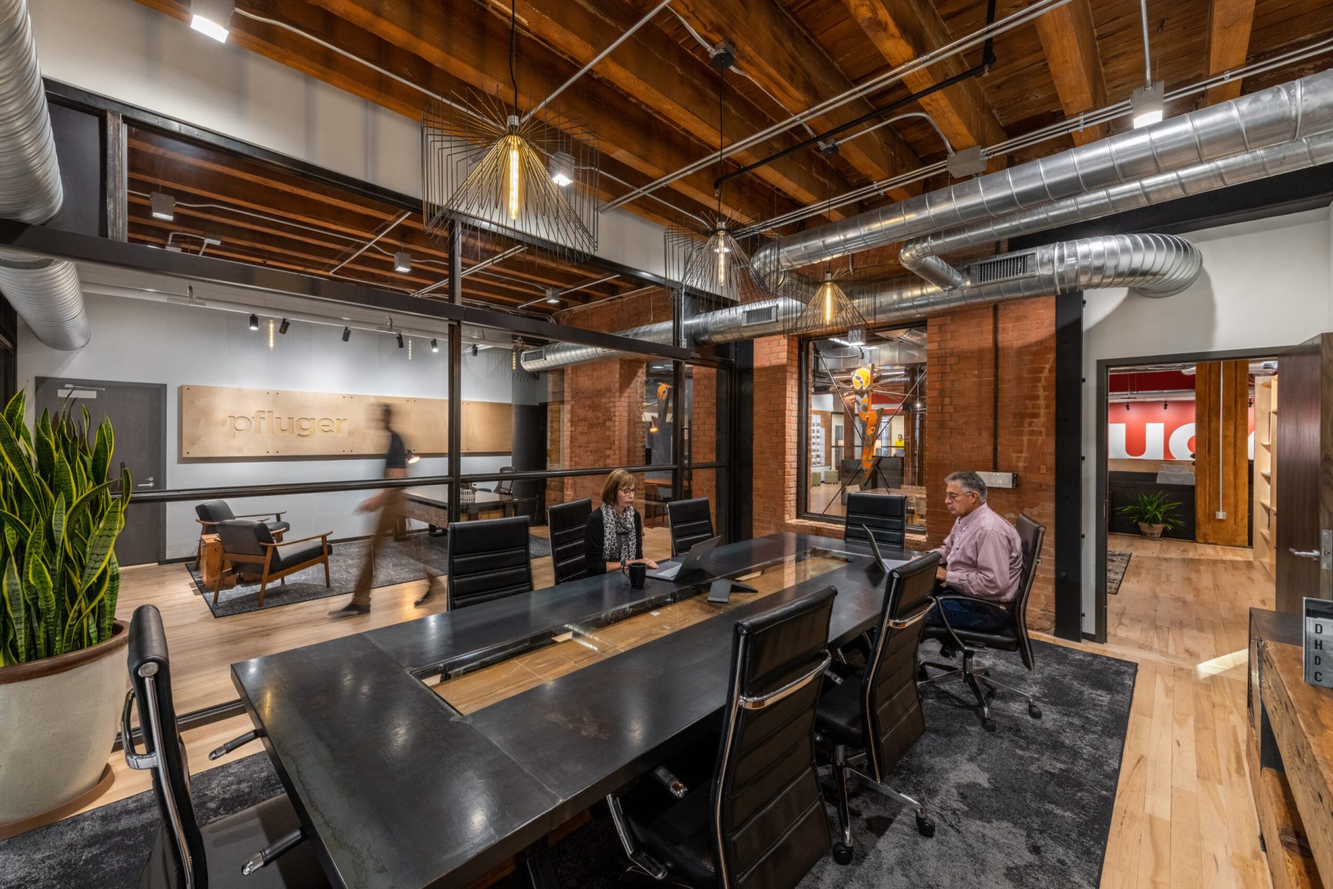
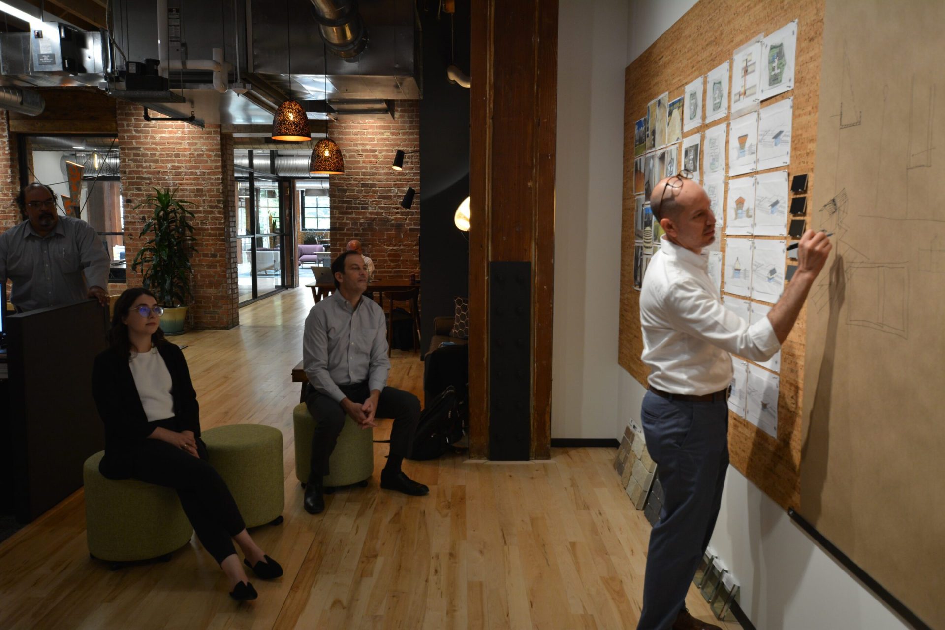
We embraced the craftsmanship and industrial character of the historic building by celebrating the raw imperfections of natural materials. We put natural cork on pristine white walls, combined Baltic birch millwork with 100-year-old brick, and added raw steel accents against a backdrop of old sawn timber – the contrasting materials make the space engaging and tactile. The space not only reflects Pfluger’s culture and design values, but provides an aspirational environment for our Dallas team!

  • Client Dallas, TX
  • Category Emerging Markets
A few challenges presented themselves in the design of our 3,700 SF Dallas office...
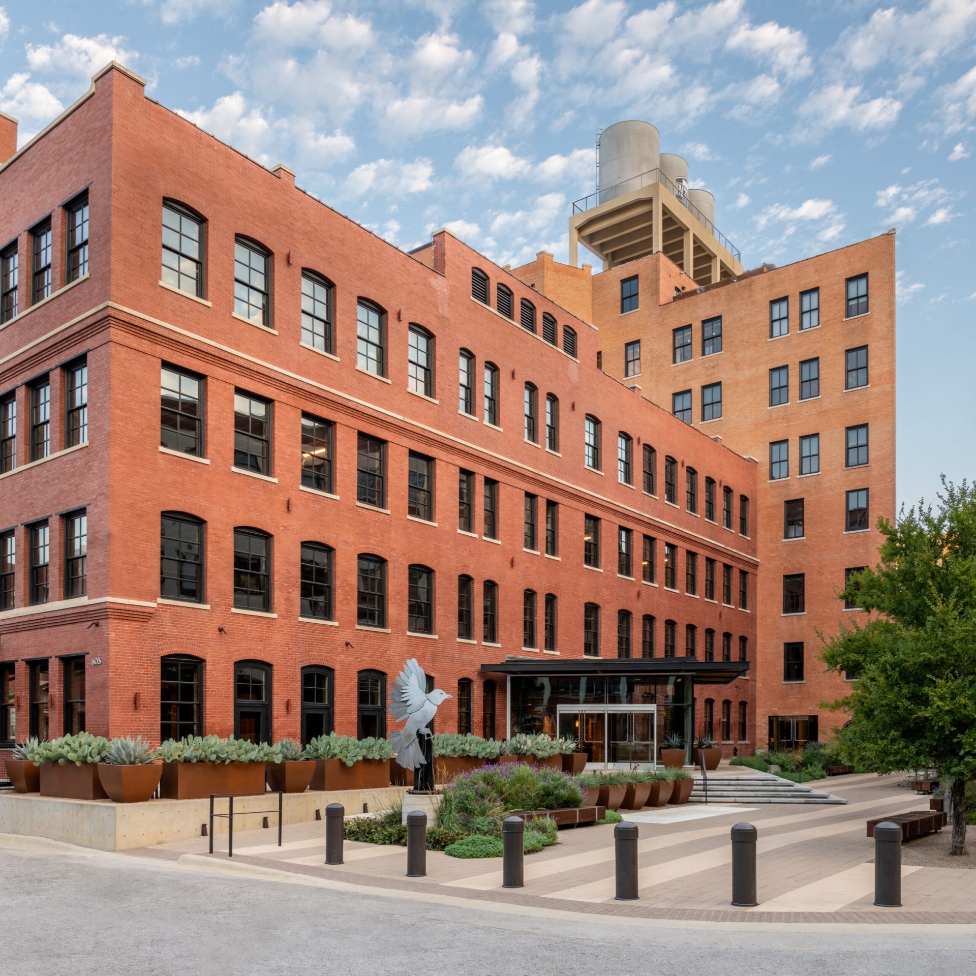
one of them being capturing our firm’s brand within the confines of a circa 1903 space.

The second was an L-shaped core with century-old timber columns creating pre-defined constraints for the design. And the third was an ambitiously limited budget of $59/SF that needed to include finish- out and FF&E. Finally, the company’s ethic is to design to a minimum LEED Silver standard, regardless of whether the client pursues certification. The new office had to be designed with LEED Silver specifications of sustainable principles and building practices.

Harmony, honesty, and simplicity were the core concepts that shaped the design narrative. Glazing added to the perimeter creates and dialogue with the original 1903 structure and harvests natural light to give the office a sense of openness. By intentionally layering lighting and textures, multiple work environments were created while maintaining a sense of unity. The quiet and relaxes atmosphere makes work a contemplative, organic, and holistic endeavor.

Sketch
Sketch
Sketch
Sketch

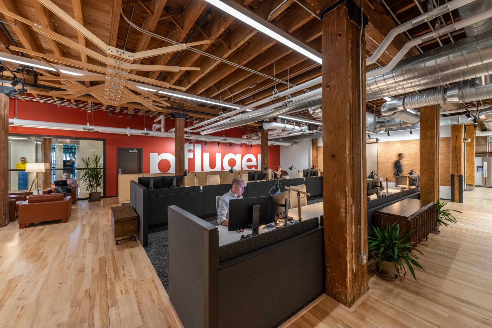
This project’s success began by embracing the architectural honesty of century-old brick and hand- hewn timbers that spoke to the craftsmanship of a bygone era. The industrial sensibility is balanced by natural elements, texture, and a restrained color palette offset by a supergraphic spanning the entire back wall. A custom steel and glass storefront was added to the south corner to provide natural light and connectivity to the outdoors.

The timber columns created challenges and opportunities. Cutting the core into thirds informed a natural division between “living” and “work” areas. However, this also limited where and how to provide crit areas, pinup boards, a sample library, and 20 workstations.

The “living room” includes a massive, live-edge, custom table adjacent to a more intimate meeting space and a chaise offering alternate workspace. The studio has room for 20 sit-stand workstations flanked by natural cork pinup walls. Custom millwork in the back provides storage while the front millwork separates the sample library, third crit area, and kitchen from the rest of the office.

The budget was maintained by repurposing fixtures and using upcycled furnishings from the local design district. Lighting fixtures were carefully curated to provide layers of ambient and task lighting.


Designs That Elevate Human Experience
More Projects